Why I Stopped Designing While Coding With Codex
The code was getting generated quickly. The slow part was deciding what the page should become while it was already being built.
When I started rebuilding my portfolio with Codex, I would ask it to build a section, open the result, change the visual direction, adjust the copy, then ask for another version.
The code was usually generated quickly. I was still deciding what the page should become while it was being built.
The WordPress case study was where I noticed this most clearly. Copy, diagrams, motion, the order of the evidence and spacing were being reviewed while individual sections were already being implemented. Each screenshot could reopen the same decisions.
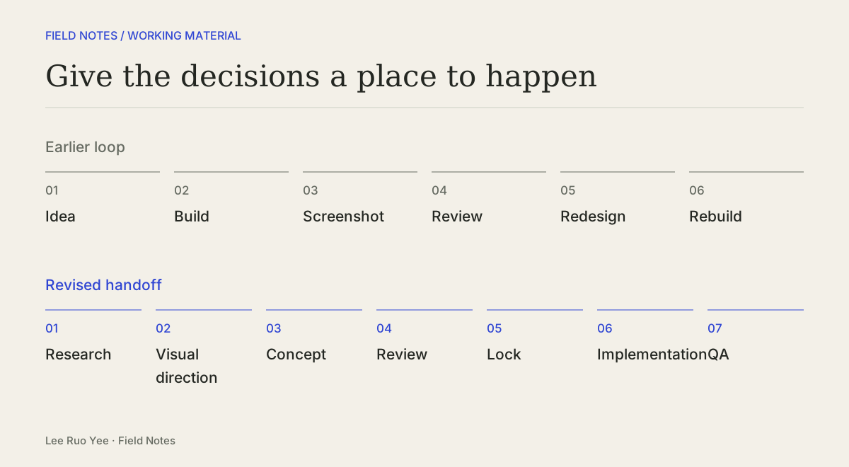
For the remaining pages, I changed the order:
GIVE THE DECISIONS A PLACE TO HAPPEN
Earlier loop
- 01Idea
- 02Build
- 03Screenshot
- 04Review
- 05Redesign
- 06Rebuild
Revised handoff
- 01Research
- 02Visual direction
- 03Concept
- 04Review
- 05Lock
- 06Implementation
- 07QA
I still use code to explore an uncertain interaction. The change was to choose the larger visual direction before asking Codex to build the page around it.
Give each stage something concrete to hand over
For the remaining pages, I asked for desktop and mobile concepts before changes to the application.
The Field Notes index is one example. I approved a direction called Papers: an index presented as working-paper sheets, with ink and cobalt accents and a shared article layout.
FROM AN APPROVED DIRECTION TO A LOCAL PAGE
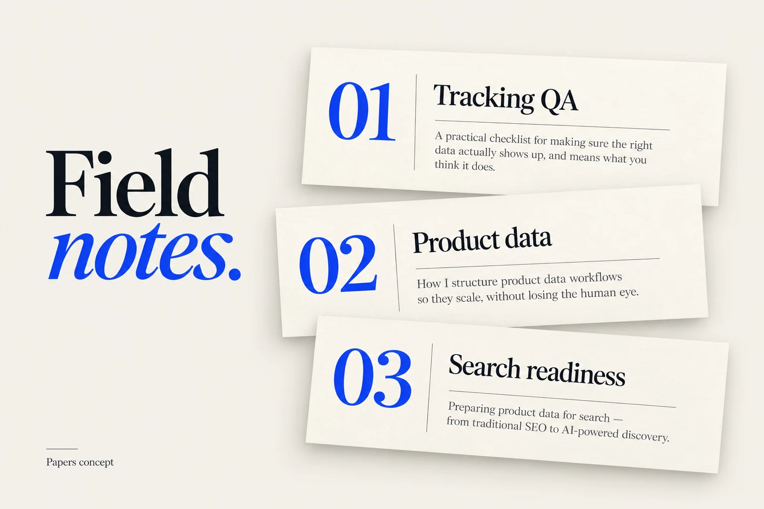
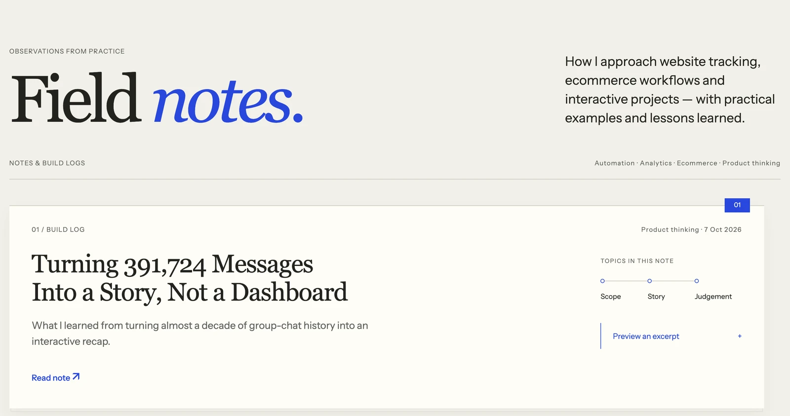
That gave implementation a selected format to preserve. Mobile title spacing and link behaviour still needed attention, but those refinements could happen within an agreed direction.
The handoff needed more than a screenshot. It also needed the important content, the behaviour to preserve and the checks to run. A short brief can hold those decisions without specifying every pixel.
Use references to identify a principle
I looked at UI references for transitions, scrolling layouts, masks and hover states. A library could help me describe a behaviour without becoming a dependency in the project.
The useful question was what to carry into this page. A reference could suggest how a surface responds to the pointer; the brief still needed to explain how a visitor would reach the article link.
One approved requirement for Papers was a fixed hover area. The paper could lift in response to the pointer, while the area detecting that pointer stayed in place. Otherwise, moving the sheet could move the hover boundary underneath the visitor's cursor.
ONE SPECIFIC BEHAVIOUR TO PRESERVE
- Outer hover area
- Stays fixed.
- Paper surface
- Can respond to the pointer.
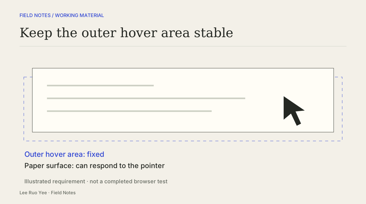
That is something a browser review can check: move onto the paper, then towards its link. The hover area should stay stable. Reaching and opening the link with a keyboard needs a separate check. These are requirements; a diagram alone does not prove they pass.
Lock a baseline, then test where it breaks
Approval did not end the design work. A built page could still reveal a mobile reading problem, an inaccessible control, misleading evidence or an interaction that behaved unexpectedly.
Those are reasons to revisit a decision. A newly found effect, on its own, is a weaker reason to reopen the page's visual identity. A defect needs a correction; a proposed new direction needs a decision about what changes and why.
Small prototypes still have a place when an interaction is difficult to judge from a static concept. Exploring that uncertainty does not have to commit the rest of the page to a new design.
For the next AI-assisted build, I would hand over five things: the page's purpose, its important content, its main behaviour, its mobile differences and the checks to run. The example below combines the Papers direction with suggested acceptance checks.
A BRIEF TO KEEP BESIDE THE IMPLEMENTATION
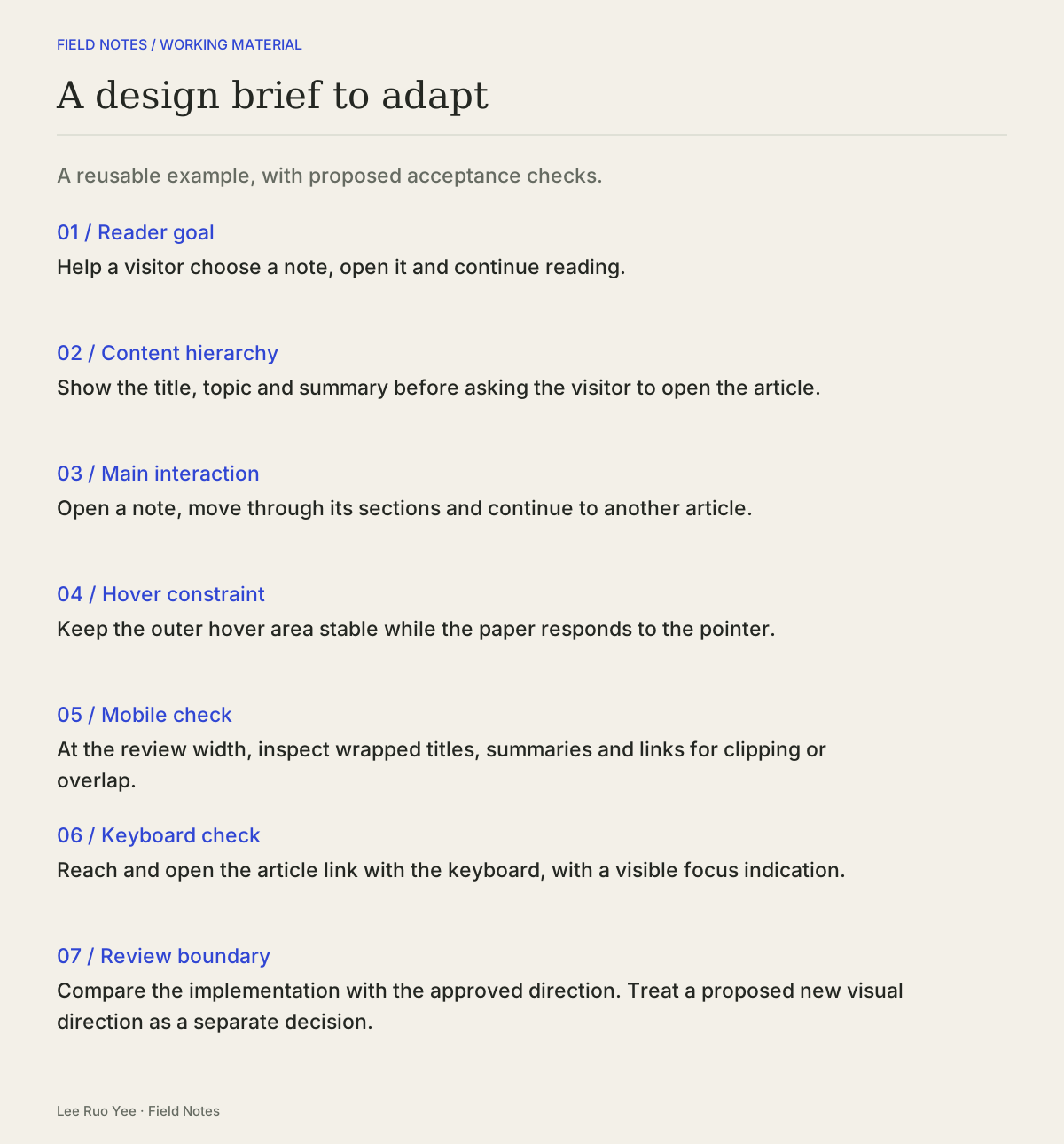
A design brief to adapt
This example combines the approved Field Notes direction with suggested acceptance checks. It is a reusable brief, rather than a transcript of the original prompt.
- 01Reader goal
- Help a visitor choose a note, open it and continue reading.
- 02Content hierarchy
- Show the title, topic and summary before asking the visitor to open the article.
- 03Main interaction
- Open a note, move through its sections and continue to another article.
- 04Hover constraint
- Keep the outer hover area stable while the paper responds to the pointer.
- 05Mobile check
- At the review width, inspect wrapped titles, summaries and links for clipping or overlap.
- 06Keyboard check
- Reach and open the article link with the keyboard, with a visible focus indication.
- 07Review boundary
- Compare the implementation with the approved direction. Treat a proposed new visual direction as a separate decision.
Before asking Codex to build, I would check that the brief names those decisions and leaves any unresolved question visible. During review, I would compare the page with that brief and inspect the actual behaviour.